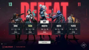
Valorant is about to get a fresh coat of paint in patch 5.08.
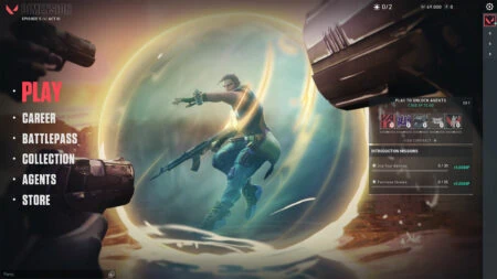
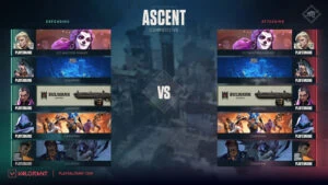
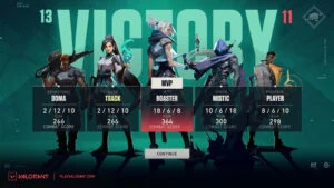
The new UI will see a complete overhaul applied to the main menu, lobby, pre-match loading screen, and end of game screens. It is a massive stylistic upgrade, featuring bolder visuals, text elements that leap out at you, and an overall more modern look.
The changes were meant to “improve legibility,” according to Riot Games, and the main menu in particular now feels far more intuitive to navigate.
But the new interface is just the beginning. Riot is also working toward a more “premium” UX/UI front-end experience that is more in line with the overall direction the game is heading.
- Harbor abilities in Valorant explained: Everything you need to know
- TenZ solidifies his legacy with Sentinels, staying with team for VCT 2023
Valorant’s new UI looks like a major upgrade
The new agent browser UI in patch 5.03 was the first change to be implemented in this campaign. Agent textures were replaced by 2D key art illustrations and updated color schemes to match each agent’s unique personality, which now fit in far better with the rest of the UI.
The individual tabs in the main menu have now been removed, replaced by bold text in a vertical menu. The “Play” button is bigger and highlighted in red, so you no longer have to squint at the top bar to figure out how to get into a game.
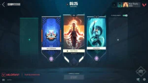
You’ll also notice the new lobby screen, which looks far cleaner than before. “We wanted to remove a lot of visual clutter and improve the overall readability of the Lobby Screen,” said Oliver Zumstein, Visual Design Manager.
“We had a lot of decorative elements that were pretty but didn’t really serve a purpose. In order to emphasize the player card and its representation, and to give you a clear ‘call to action,’ we increased the screen’s contrast, pushed color values, and simplified our shape language.”
The result is a lobby screen that allows player cards to really pop and stand out more.
Elsewhere, the pre-match loading screen is getting a similar visual treatment for an overall more dramatic feel. “We want the faceoff screen to be all about the two teams about to duke it out,” said Max Smiley, Staff Engineer.
“We removed the map so your banners could take up the screen, better showing off your identity through your chosen player cards, titles, and rank badges. We punched up both sides’ colors, mirrored banner layouts for symmetry, and added ‘VS’ text to emphasize the head-to-head feeling.”
Finally, there are now separate victory and defeat screens, depending on the outcome of the match. To emphasize the team aspect of Valorant, agent avatars now make an appearance on the end game screen, with the team MVP given a place of honor in the middle.
All new features shipping this year will follow this new visual direction, said Riot, as it works to bring motion design and additional visual polish to the game.
You can read the full blog post here.
READ MORE: Valorant dev details how many games you need to reach your real rank
